Customising additem.to: make it show what you care about
A card collector, a landlord and someone tracking tools all want a different thing on screen. This guide covers the five settings that change what additem.to puts in front of you: what each row shows, list or grid, which sections appear on an item, the filter you open on, and the columns in an export.
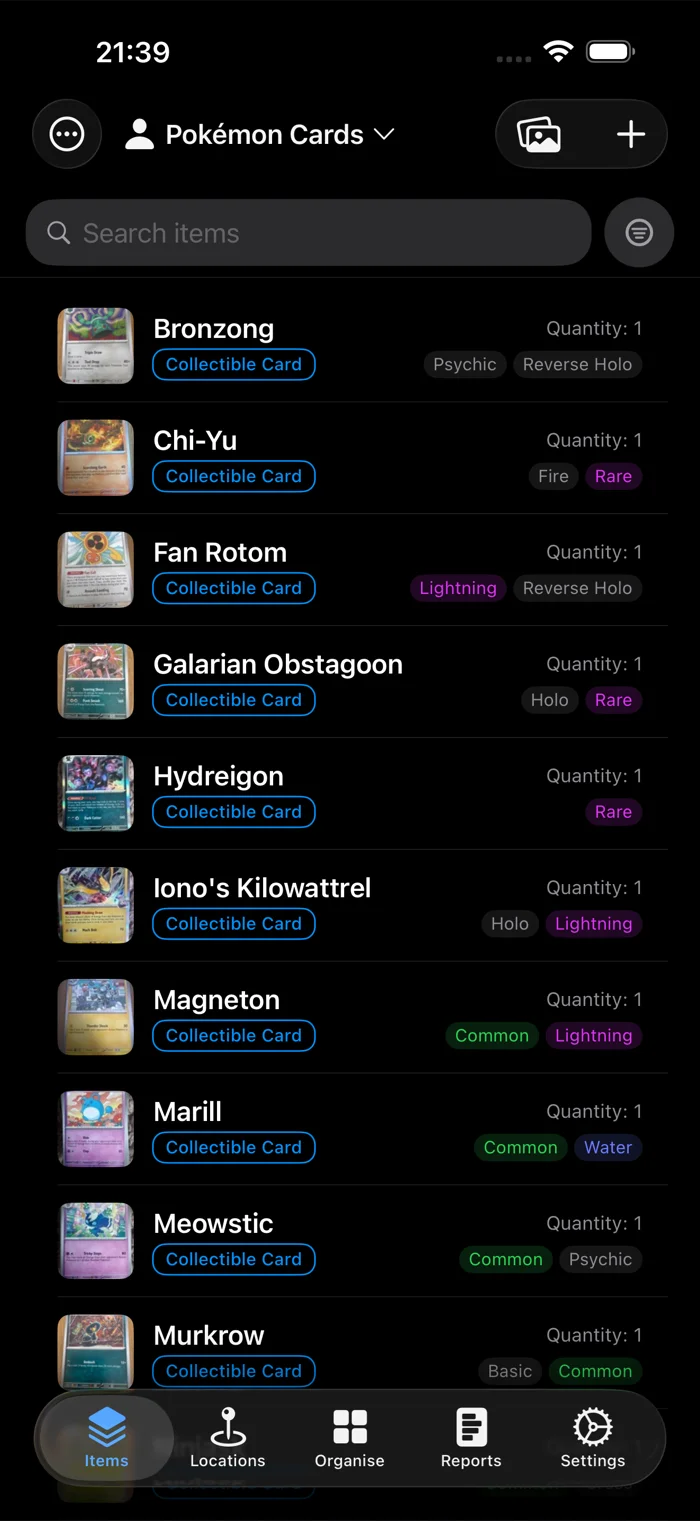
Out of the box, additem.to shows a name, a category and a quantity on each row. That suits a lot of inventories and suits others badly. If every item you own is a Collectible Card, a category on every row tells you nothing, and the rarity you actually sort by isn't there at all.
All five settings below are free, and none of them touch your data. They change what the app displays.
Choose what each row shows
Go to the Organise tab and tap Item Display. There's a shortcut from the item list too: the ... menu, then Customise Layout.
A row has four slots: top left, top right, bottom left and bottom right. Tap any one and pick what goes in it. You get thirteen standard fields (name, description, category, quantity, unit, location, tags, manufacturer, model number, serial number, purchase price, purchase date, notes) and every custom field in the inventory. The top left slot is the row's heading, so it's shown in bold, unless it holds the category or tags, which keep their own look.
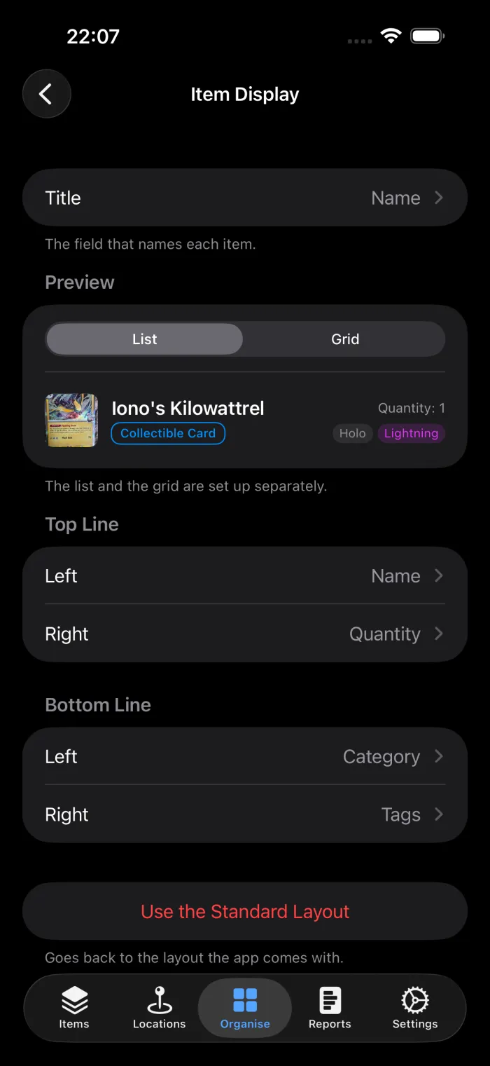
Two smaller options are worth knowing. Each slot has a Show the Field Name switch, which puts the label in front of the value so a bare number reads as Quantity: 3. And every slot can be set to Nothing, which closes the line up rather than leaving a gap. A two-field row is often cleaner than a four-field one.
Here's a card collection with the category on the bottom left, tags on the bottom right, and quantity top right.
Name items by other fields
An item doesn't need a name. A club directory might identify people by first and last name, and a tool store by serial number, so the name field would only repeat what's already there.
At the top of Item Display, Title picks the field that names each item. Choose one, or pick a second under Then to join two, such as First Name then Last Name. The title is used wherever an item's name would be: the item screen, the Name slot of a row, reminders, labels and reports. The list sorts by it too, so a directory lists people by first name and then last name.
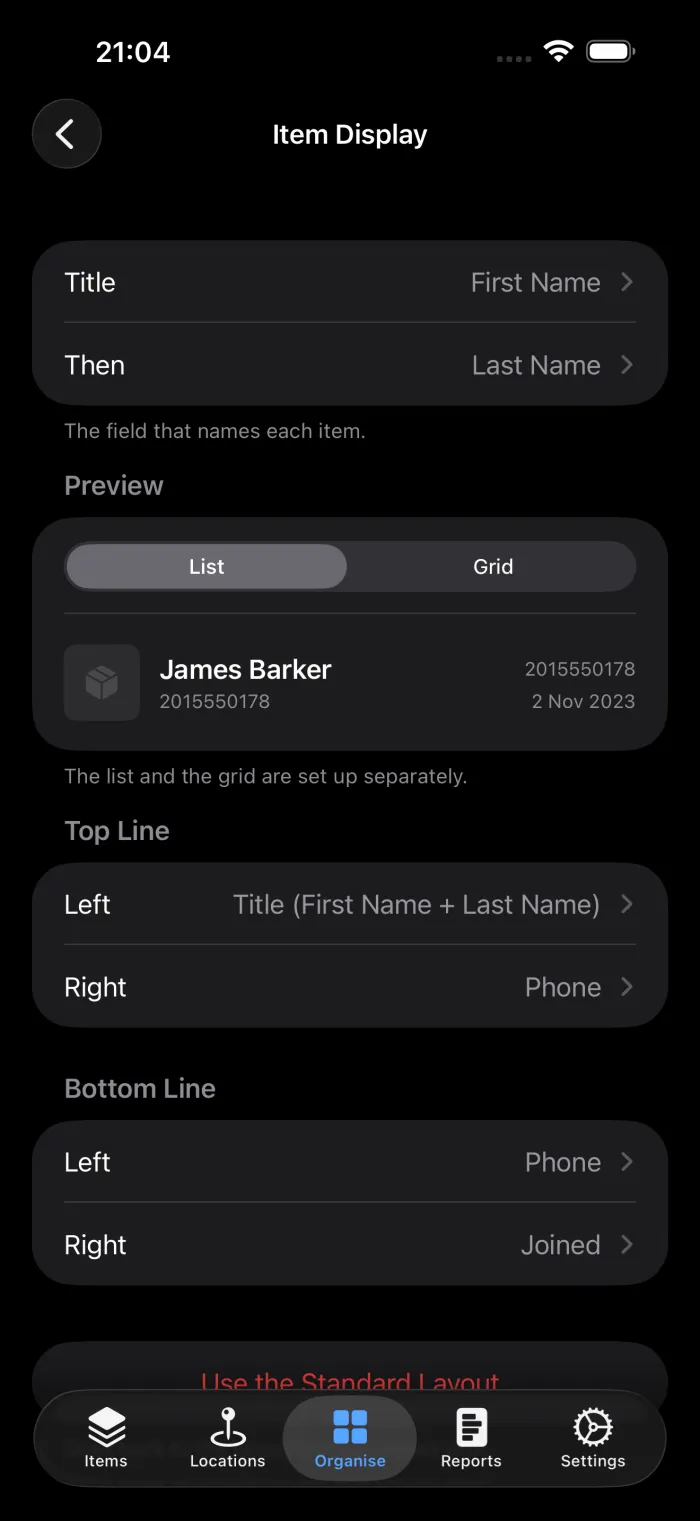
Once a title is set, the Name option in the slot pickers reads Title (First Name + Last Name), so you can see what it will show. Put it top left for a bold heading on every row.
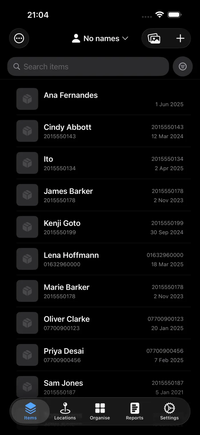
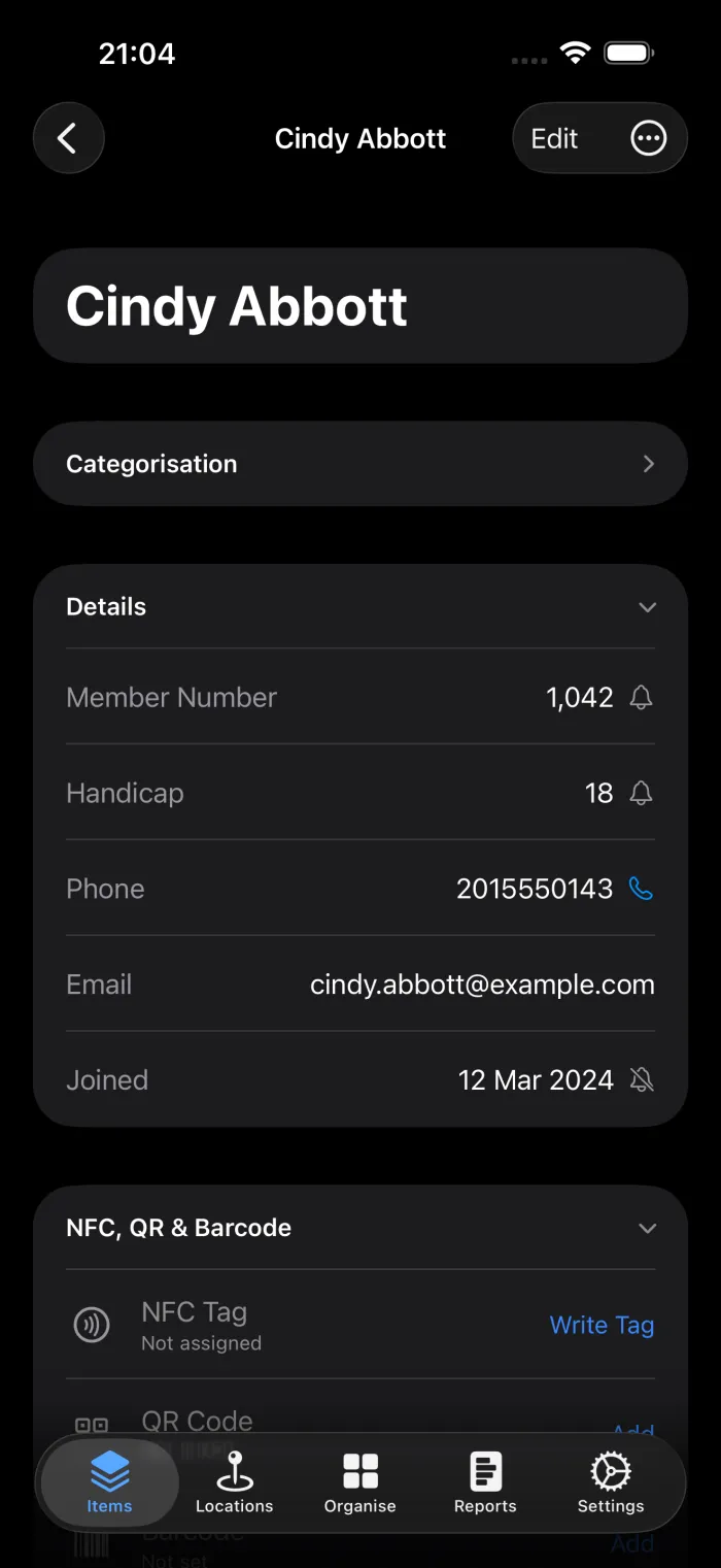
An item with nothing in its title fields falls back to its name, and one with no name at all shows as Unnamed item. A number field, such as a membership number, can be a title on its own, and the list then sorts by the number, so 9 comes before 10.
See your items as pictures
Some inventories are easier to recognise than to read. Open the ... menu on the item list and tap View as Grid to swap the rows for photo tiles.
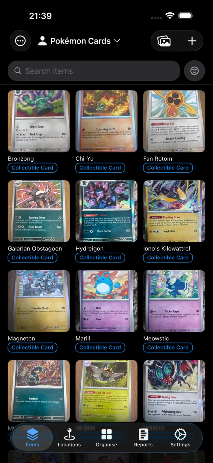
The grid has its own layout. Switch the preview in Item Display from List to Grid and you'll see two slots instead of four: a tile is narrow, so it gets two stacked lines under the photo rather than four corners that would all truncate.
Hide the sections you never use
An item screen has ten sections, and most inventories don't need all ten. If you never lend anything out, the Loans section is just something to scroll past.
Organise, then Item Sections, has a switch for each one.
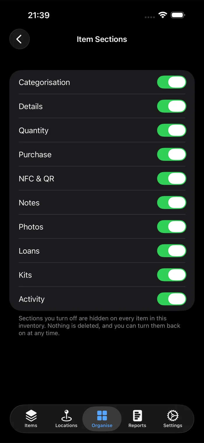
Turning one off hides it on every item in that inventory. Nothing is deleted. If you hide Purchase and later add a purchase price by importing a CSV, the value is still there waiting when you switch the section back on.
Open on the filter you use most
If you always start by filtering to one thing, you can make that the state the app opens in.
Set up the filter you want on the item list, then open the ... menu and tap Set as Default Filter. From then on the list opens with it applied. Clear Default Filter in the same menu undoes it.
The option only appears when a filter is actually active, so set the filter first.
Choose the columns in a CSV export
A full export is wide. If you're sending a list to an insurer or pricing up a shelf, you probably want four columns rather than thirty.
Open the ... menu on the item list and tap Export Items. Every column has a switch, grouped the way the item screen is: Identification, Location and Status, Purchase Info, and your custom fields at the end.
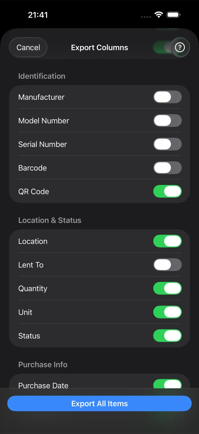
ID and Name can't be turned off. ID is the column a reimport matches on, so without it every row comes back as a new item. Your selection is remembered per inventory, so a spreadsheet you produce every month only needs setting up once.
There's more on the file itself in the CSV export guide.
What's shared, and what stays on your phone
This catches people out on shared inventories. Some of these settings belong to the inventory and some belong to you.
| Setting | Applies to |
|---|---|
| Item Display layout | The inventory. Everyone who uses it sees the same rows. |
| Title | The inventory, like the layout. |
| Item Sections | The inventory. On Pro Cloud this syncs across your devices. |
| List or grid | Your device only. |
| Default filter | Your device only, and set per inventory. |
| Export columns | Your device only, and saved per inventory. |
If you change the row layout on an inventory you share with a partner or a colleague, they get the change too. additem.to warns you before it does that.
On the web
With Pro Cloud, the web app has Item Display too, under Inventory Settings in the sidebar. It sets the title and the four slots of a list row, and the change reaches your phone with the next sync. The web has no grid view, so the grid is set up in the app.
Starting over
Item Display has a Use the Standard Layout button at the bottom, which puts the rows back to what the app ships with. It only shows up once you've changed something.
additem.to is free on iPhone, with no account required and unlimited items in your first inventory. Every setting in this guide is free in the app.
Download free on the App Store